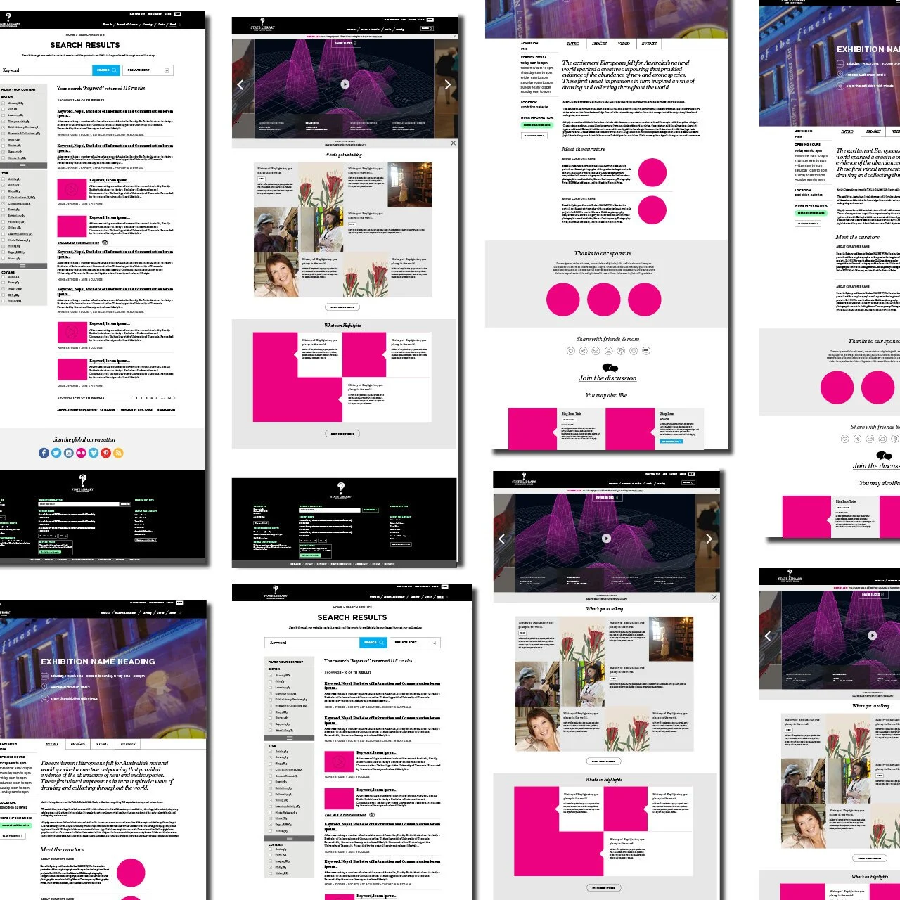
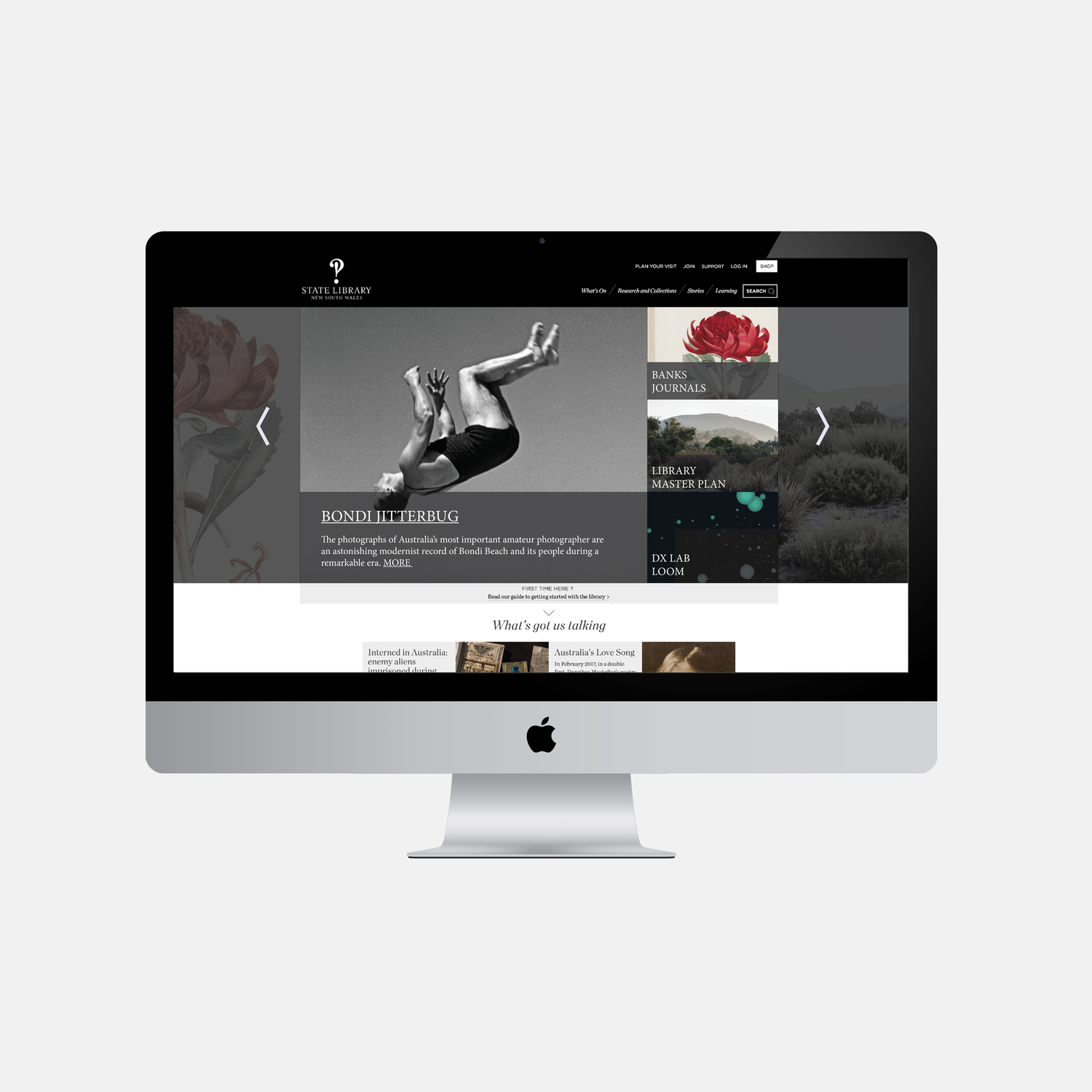
The library had a branded website design that was beautiful, but did not suit the search functionality and vast catalogue of books, photographs and more, that was growing by the day as part of the digitisation project.
The challenge was to keep the visual appeal of the branded design, but allow it to function as a way for the public to access the collection. Whilst the old site was chunky and clearly needing an overhaul, the site was a home to 2 million + regular users that were used to the site's existing framework for anything from PHD study, HSC education units to family history research. The site could not just be switched over without taking those users with us as we changed.
I worked closely with front of house staff to aid this change, but existing users were not always identifiable. User experience was critical here. The site's user flows and graphic elements such as icon cues needed to be simple and intuitive. My design solution provided simple repeatable wayfinder cues and a tight typography and colour hierarchy. A user can go from a homepage search, book an event, read a long format story and then browse the library’s catalogue, all the while being aided with clear visual cues that are consistent.


